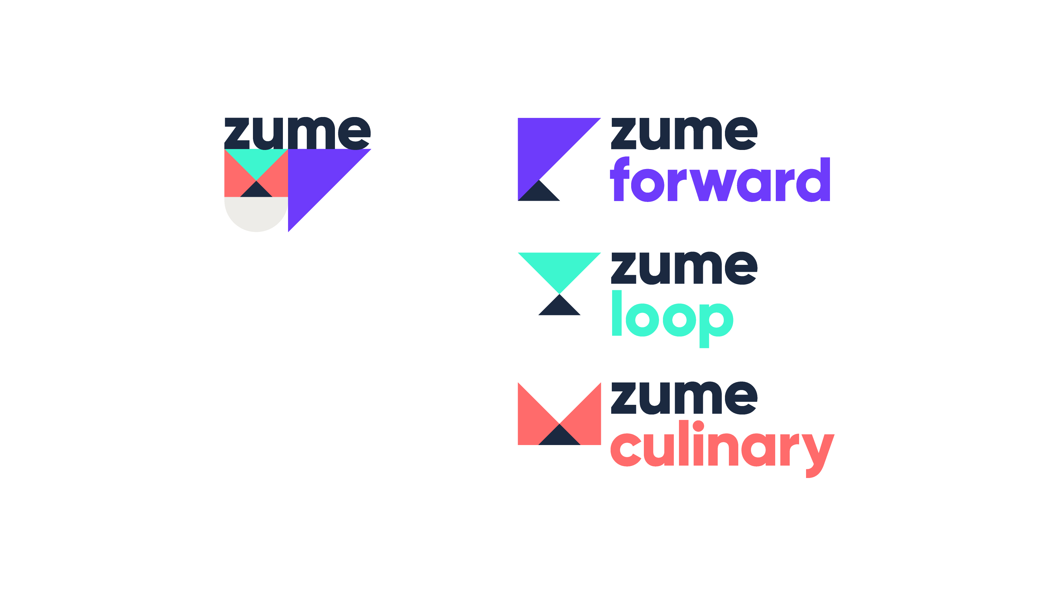
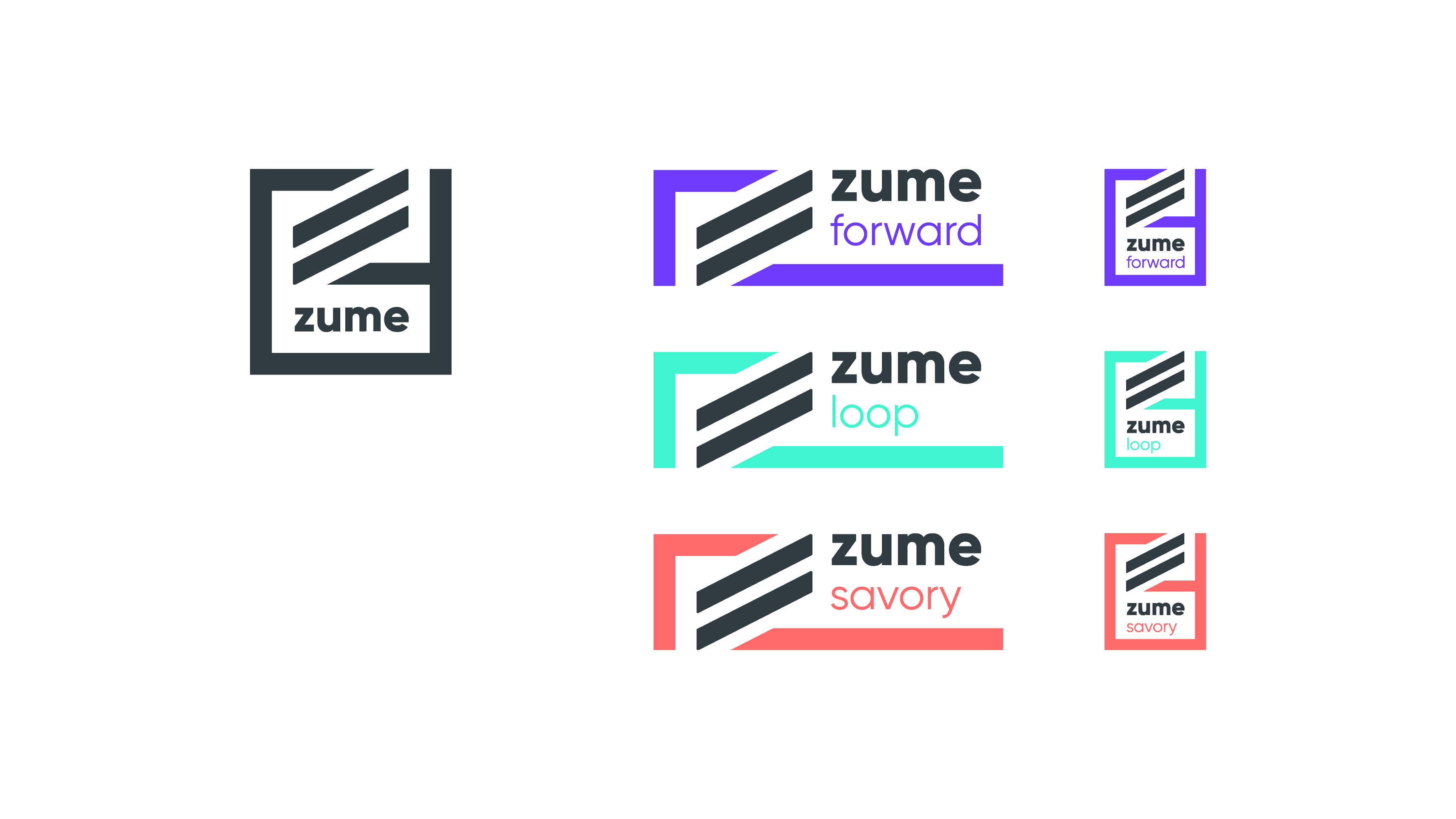
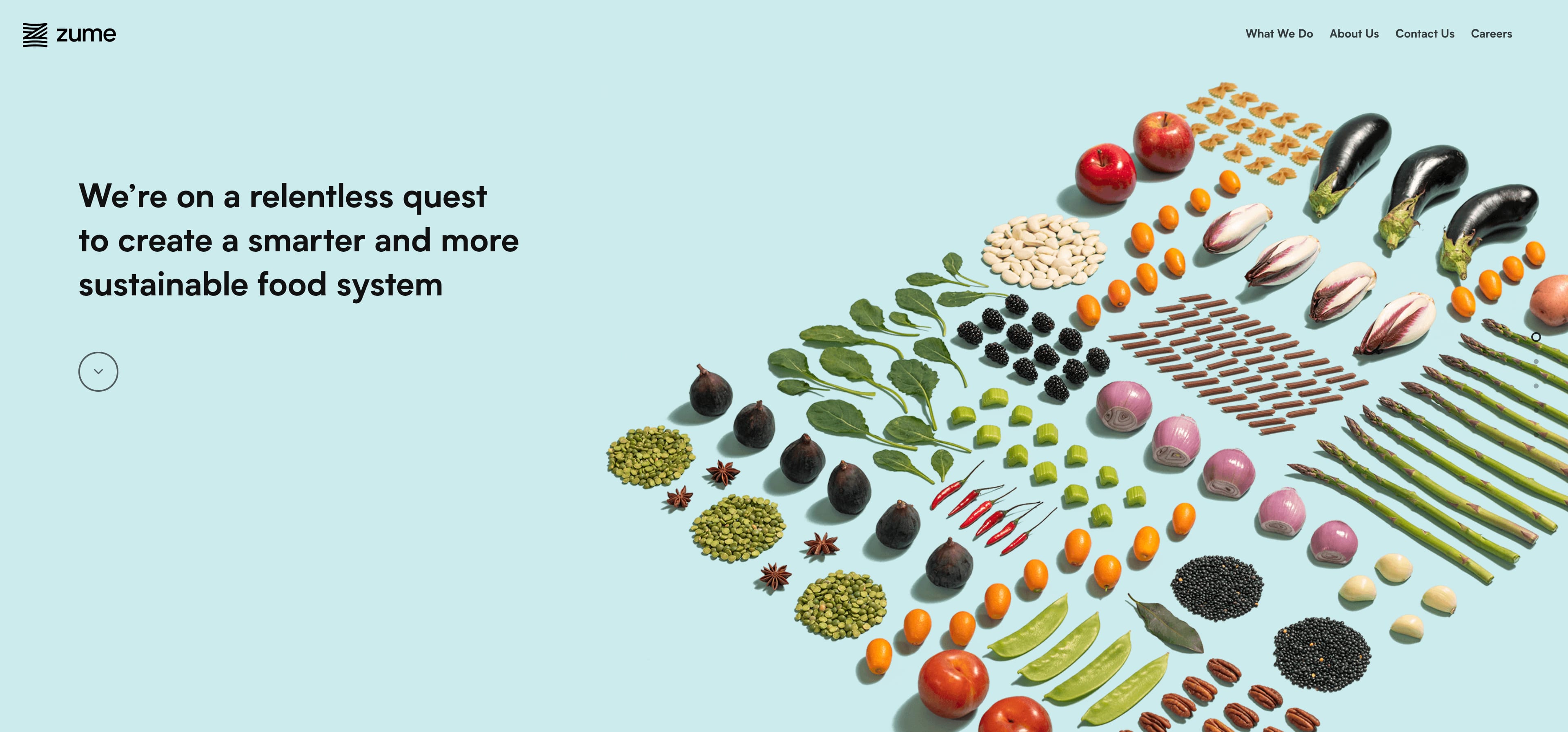
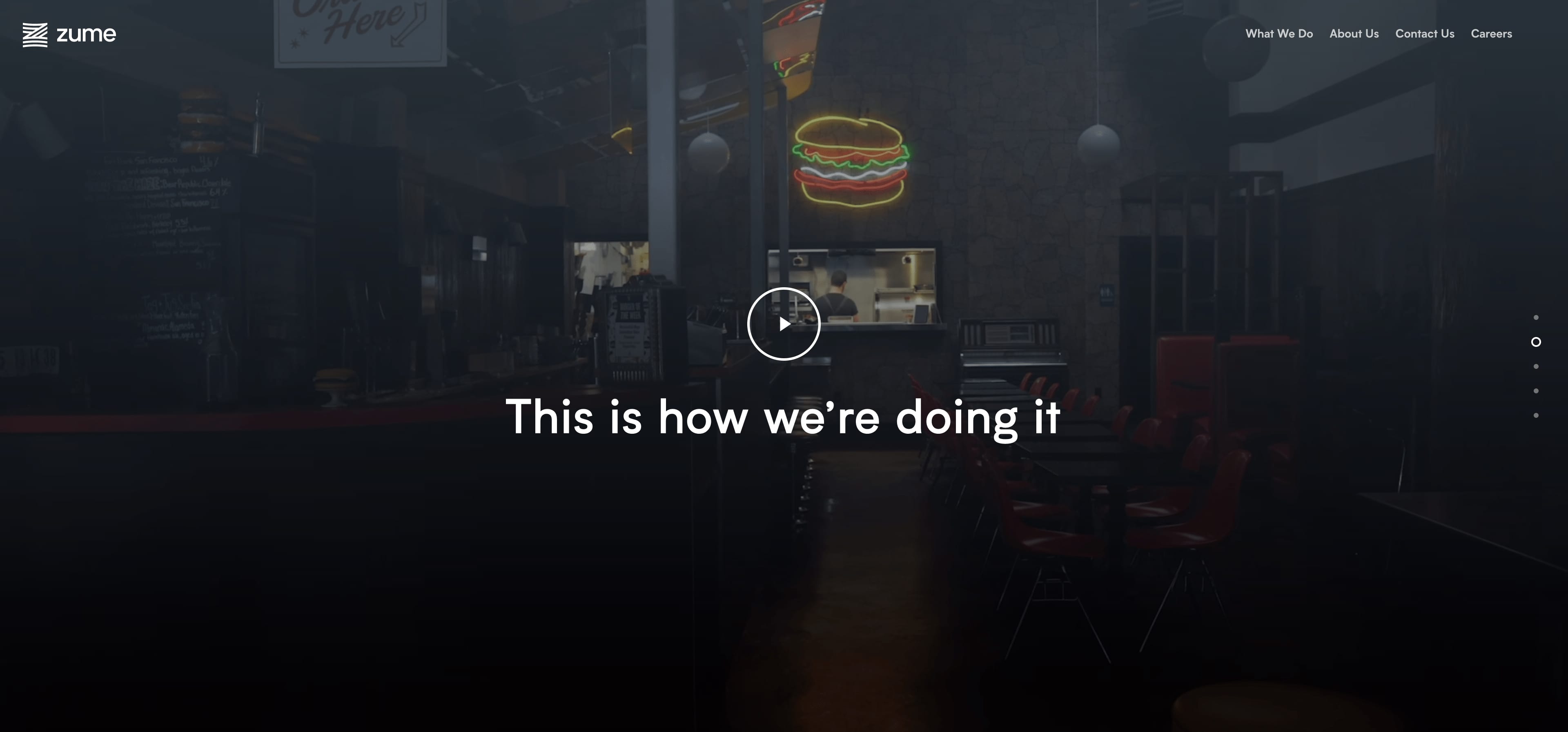
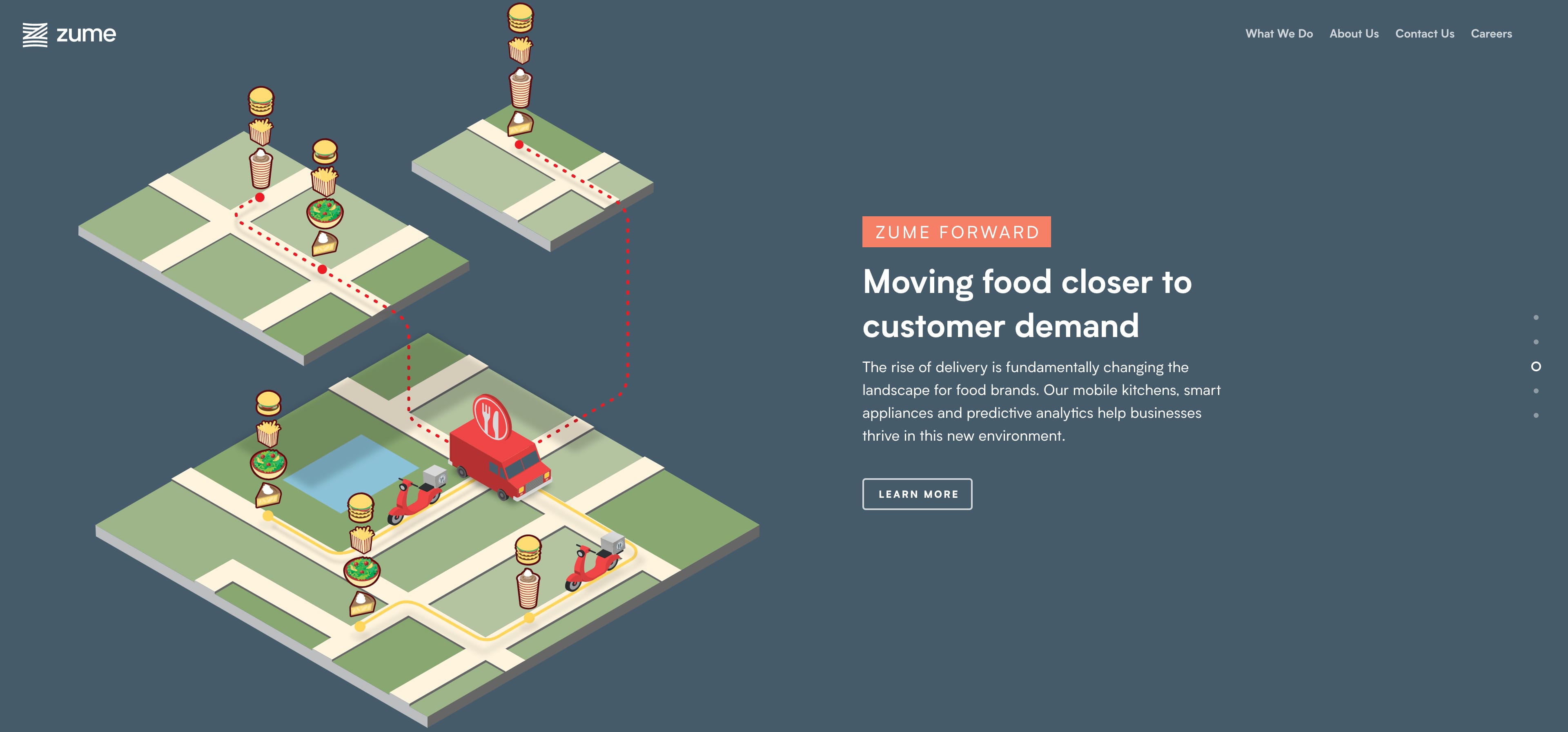
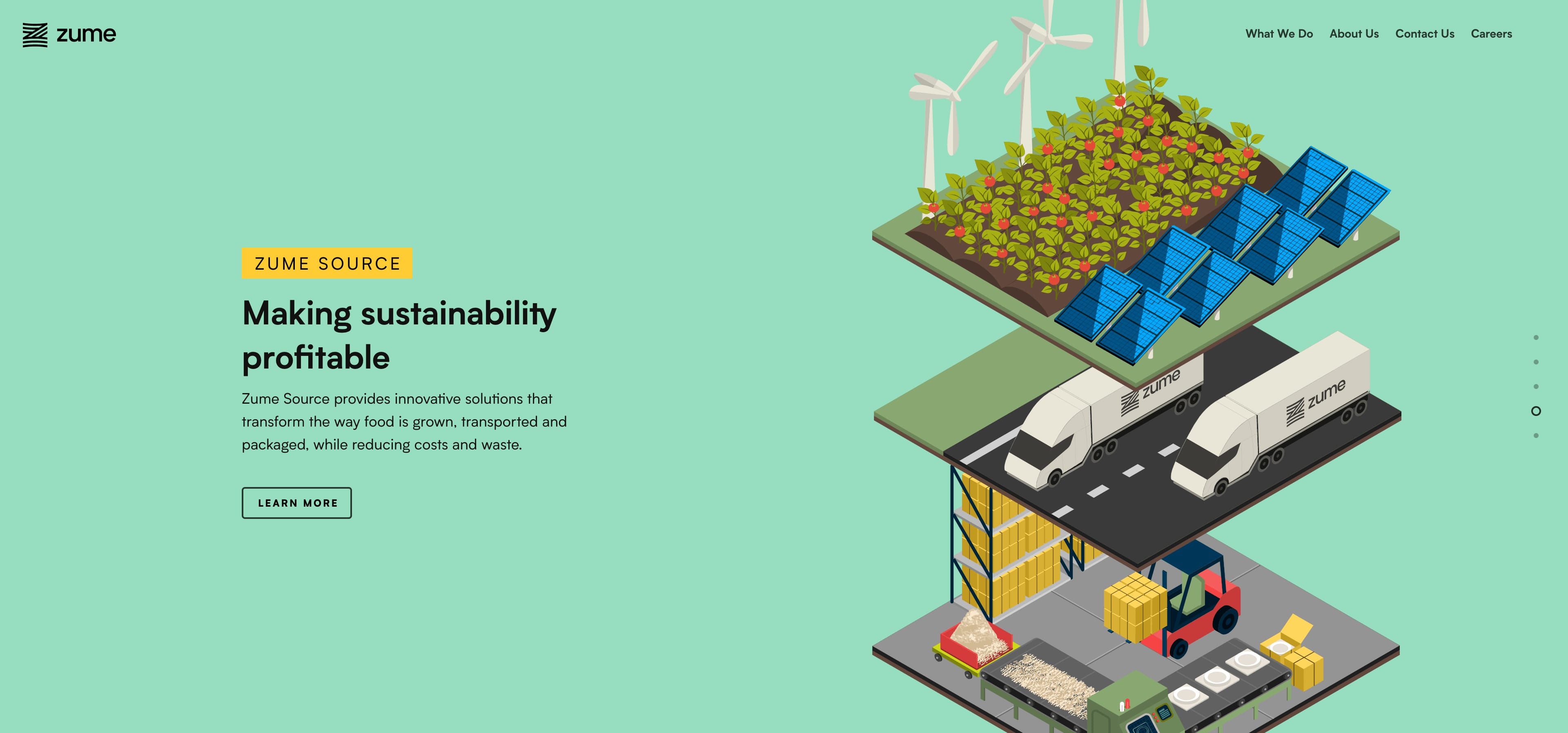
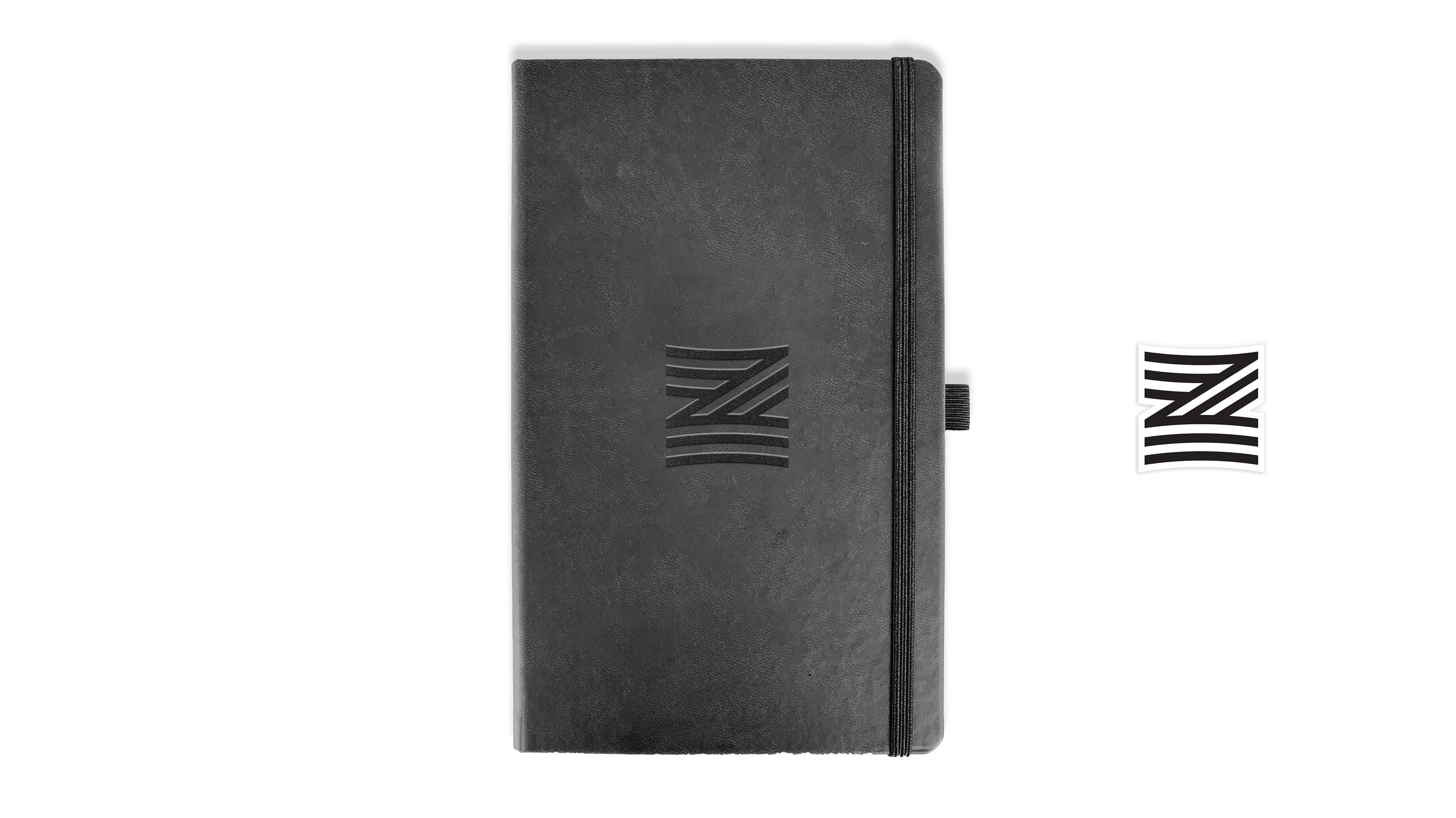
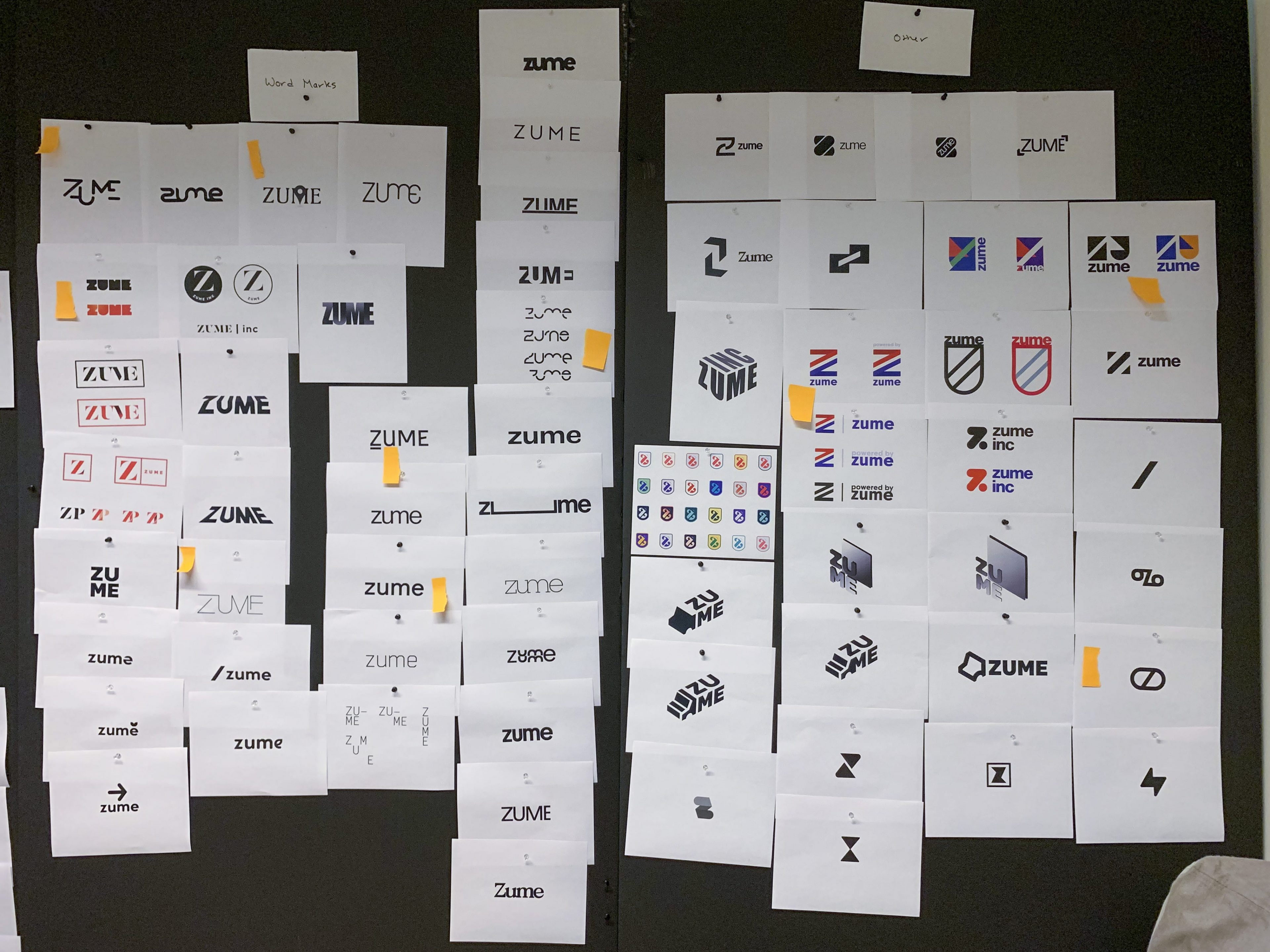
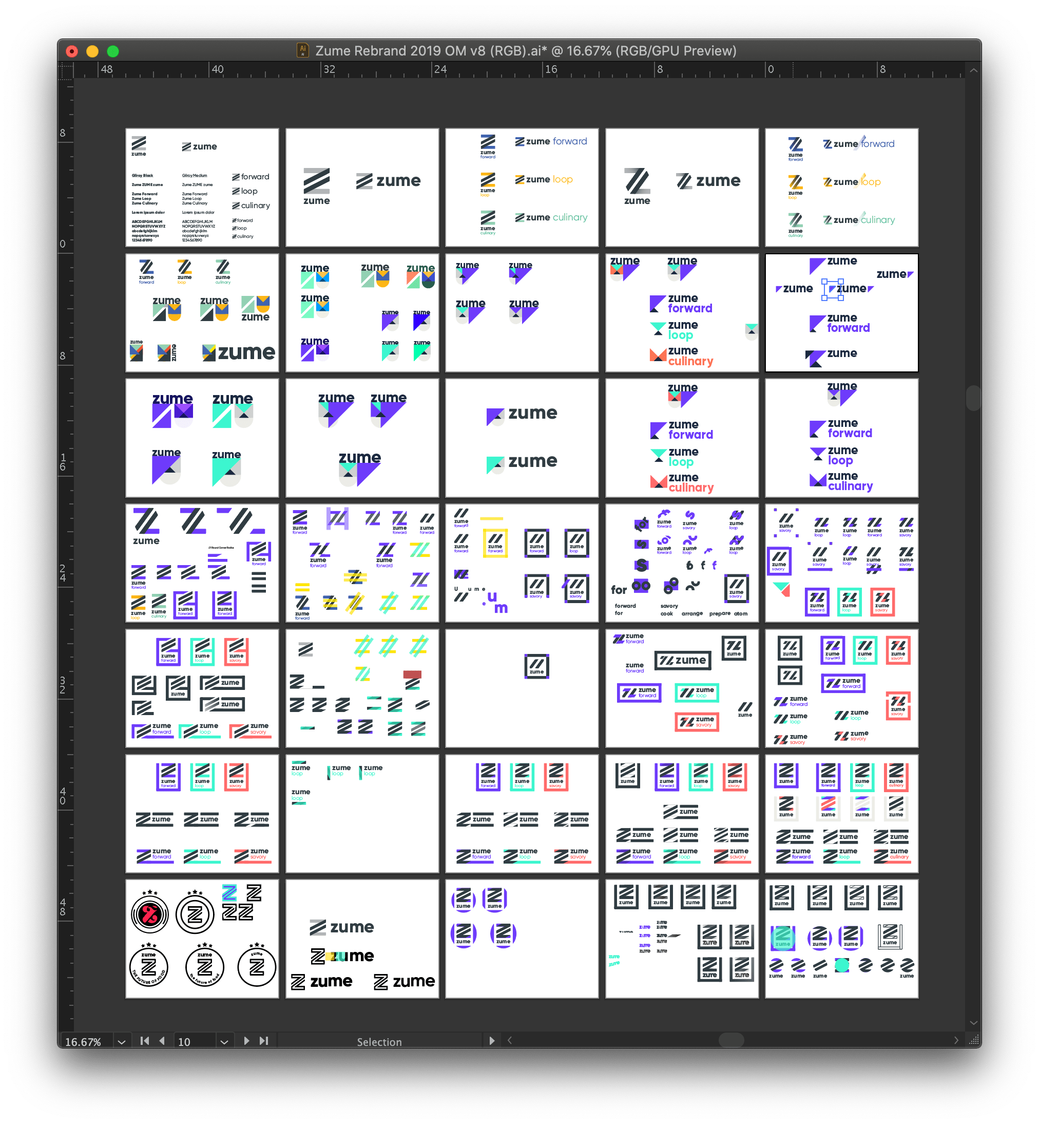
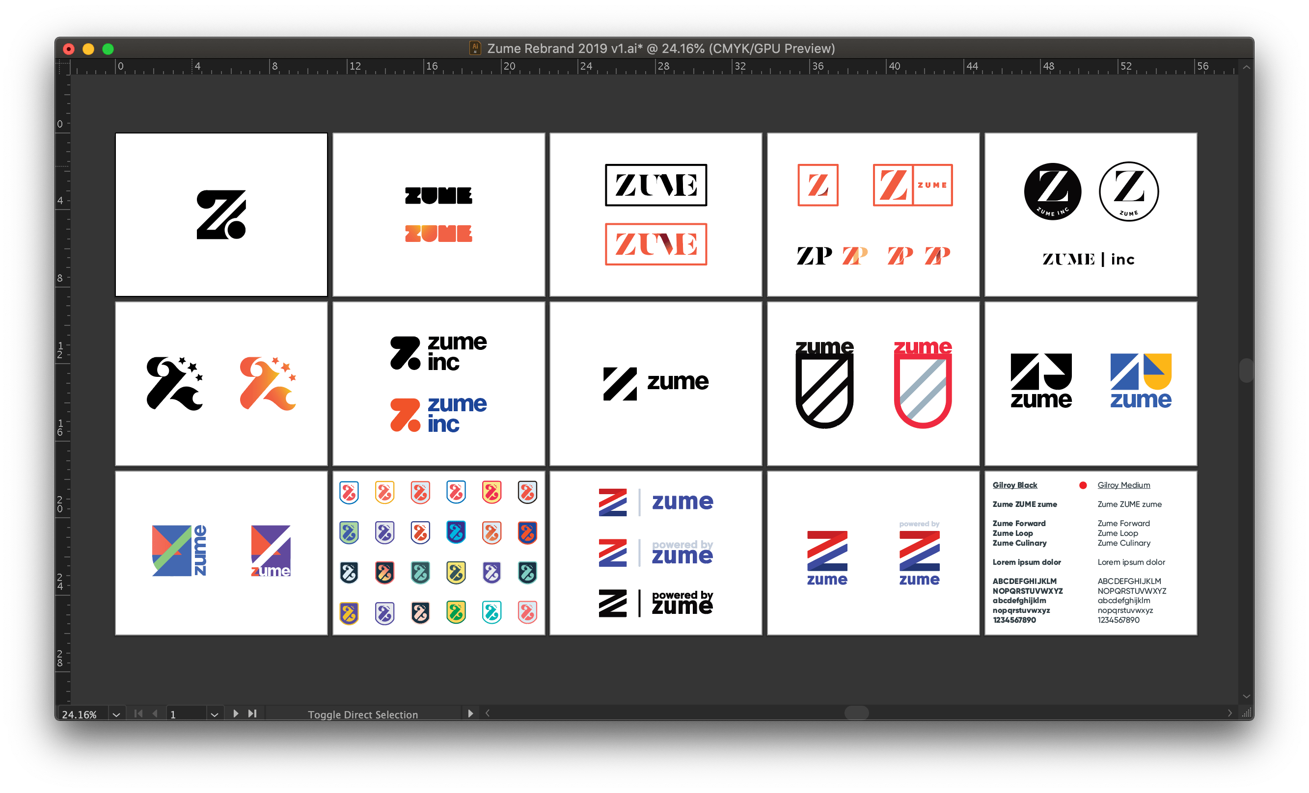
Helped develop a new brand for Zume (some of my preliminary rounds of logos below). I designed swag for employees, and I led the zume.com website build.
Creating a smarter and more sustainable food system
Rebrand + Swag + Website
Branding, swag, and a full website build for a food logistics tech startup
CREATIVE WORK
- Rebrand
- Logo exploration
- Color palette
- Employee swag
- Website build
AGENCY
CREATIVE DIRECTORS
- Brendan Finlayson
- Carrie Ammermann-Capiello
CLIENT
YEAR
2019
The problem
We were told by the executive team that we were pivoting and restructuring the company and its verticals and needed to complete an entire rebrand that would match this new vision for the company. The old logo was deemed too strong and a softer logo and set of colors were requested. We also had to think about how the new logo would work with the branding of each vertical. We also needed to do all of this from start to finish in less than two months.
Although the final design wasn't mine, I did help to optimize the logo by simplifying paths and cleaning up other inconsistencies with a fresh eye.
Before

After

What I did
Was initially part of the new logo exploration, and then led the website build and swag creation and sourcing.
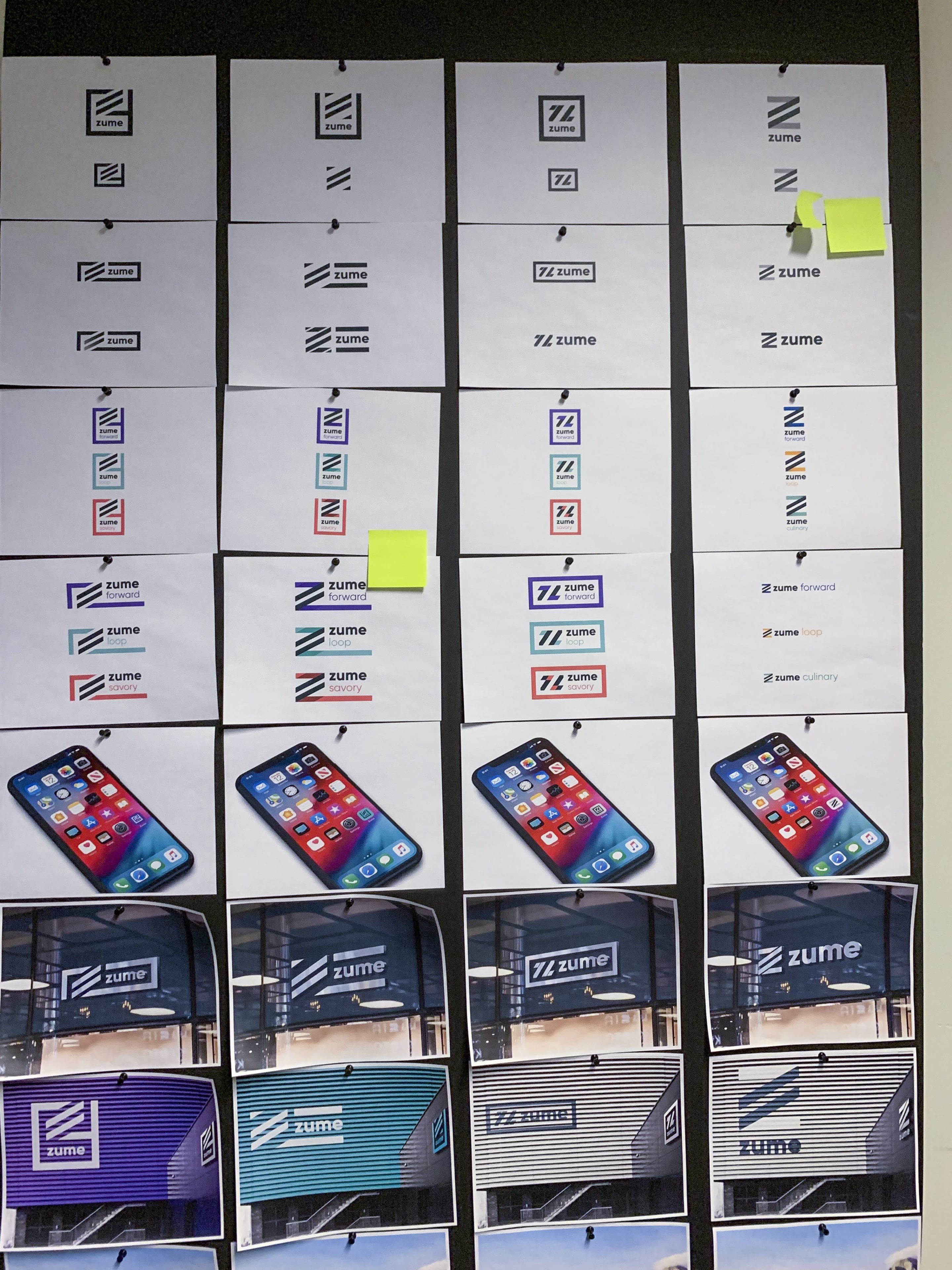
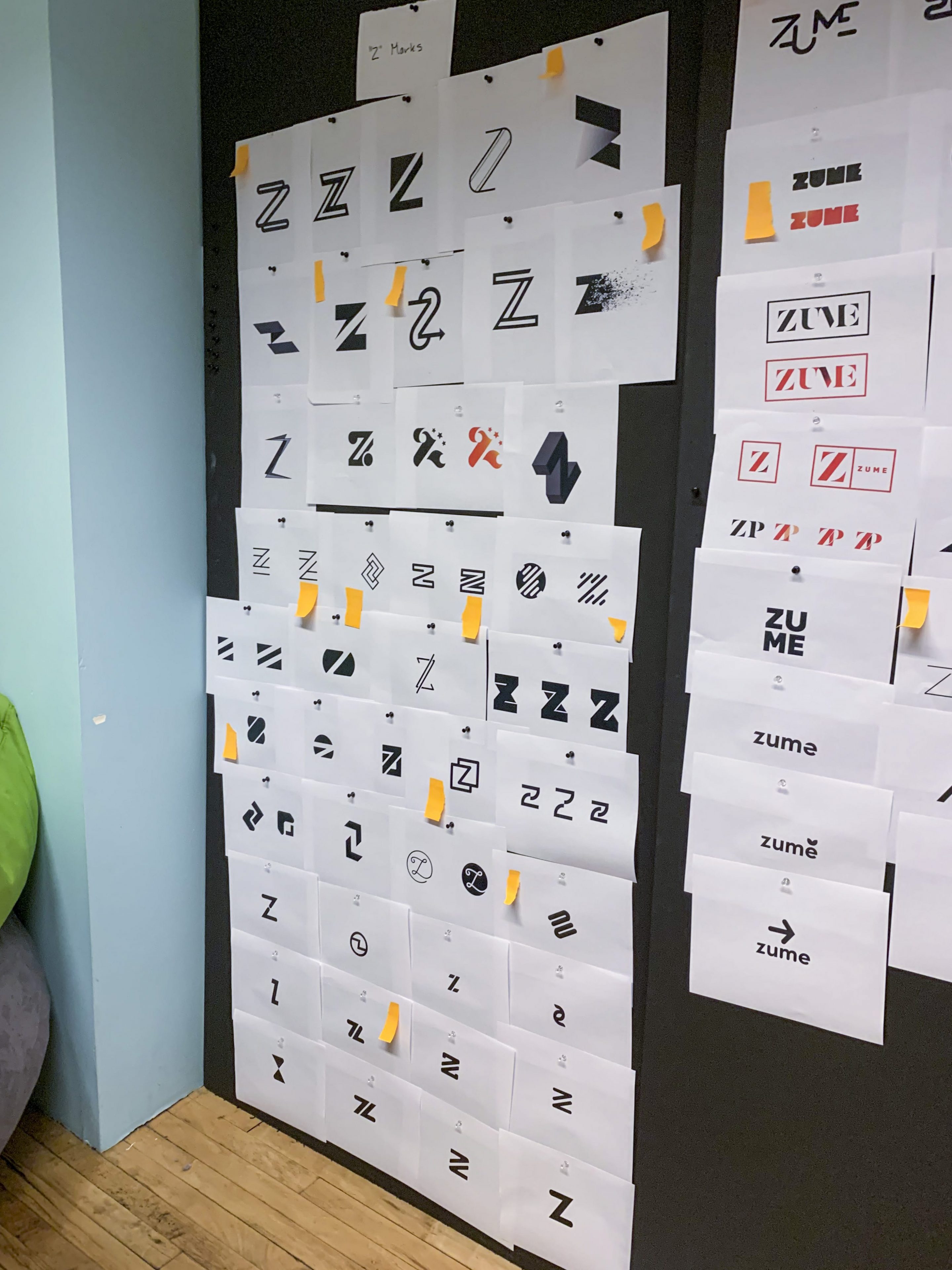
Logo exploration
I was the first of our group to start to base my designs on some sort of modular system, given the three verticals of the new organization. I really wanted my designs to be able to work in a system from the start.
Site build
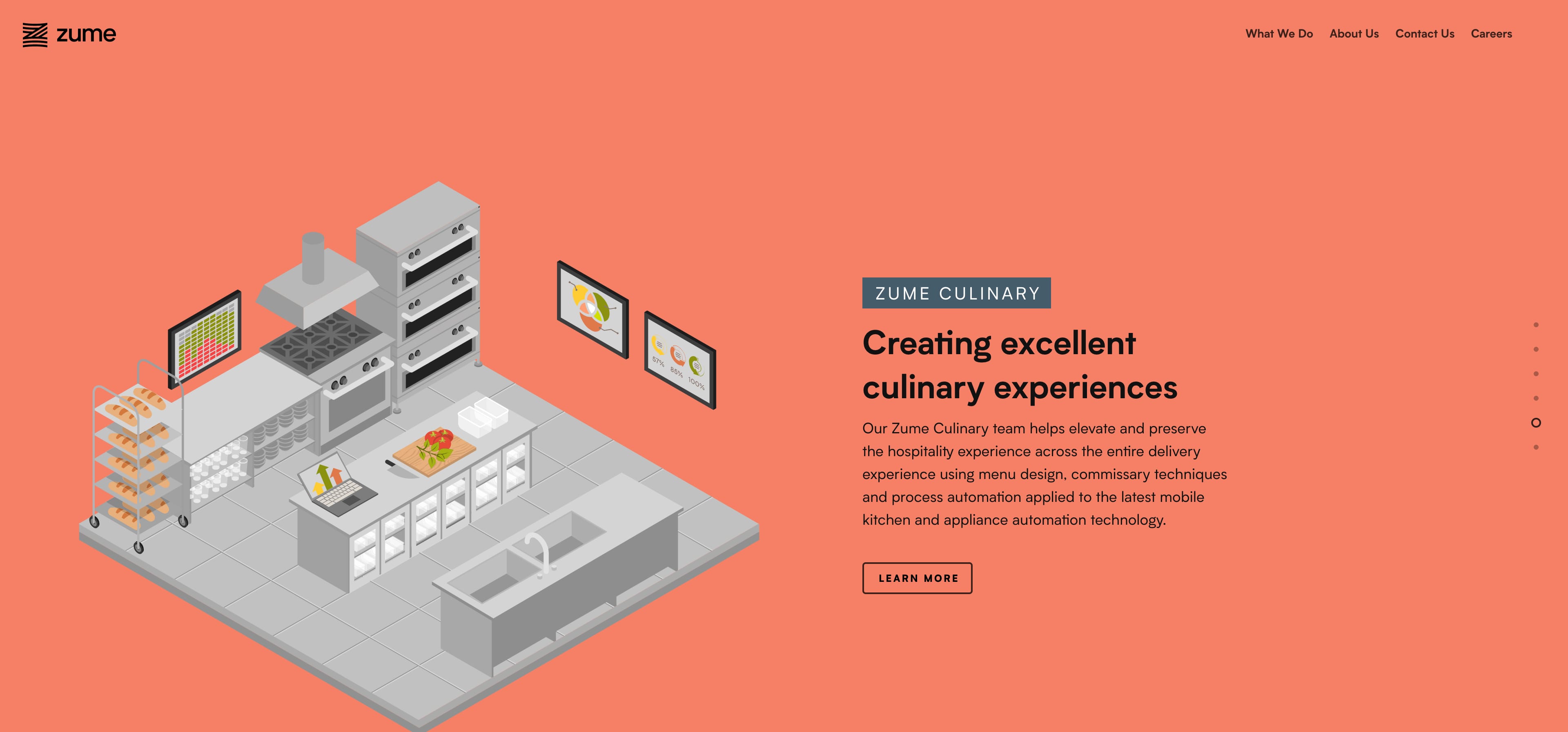
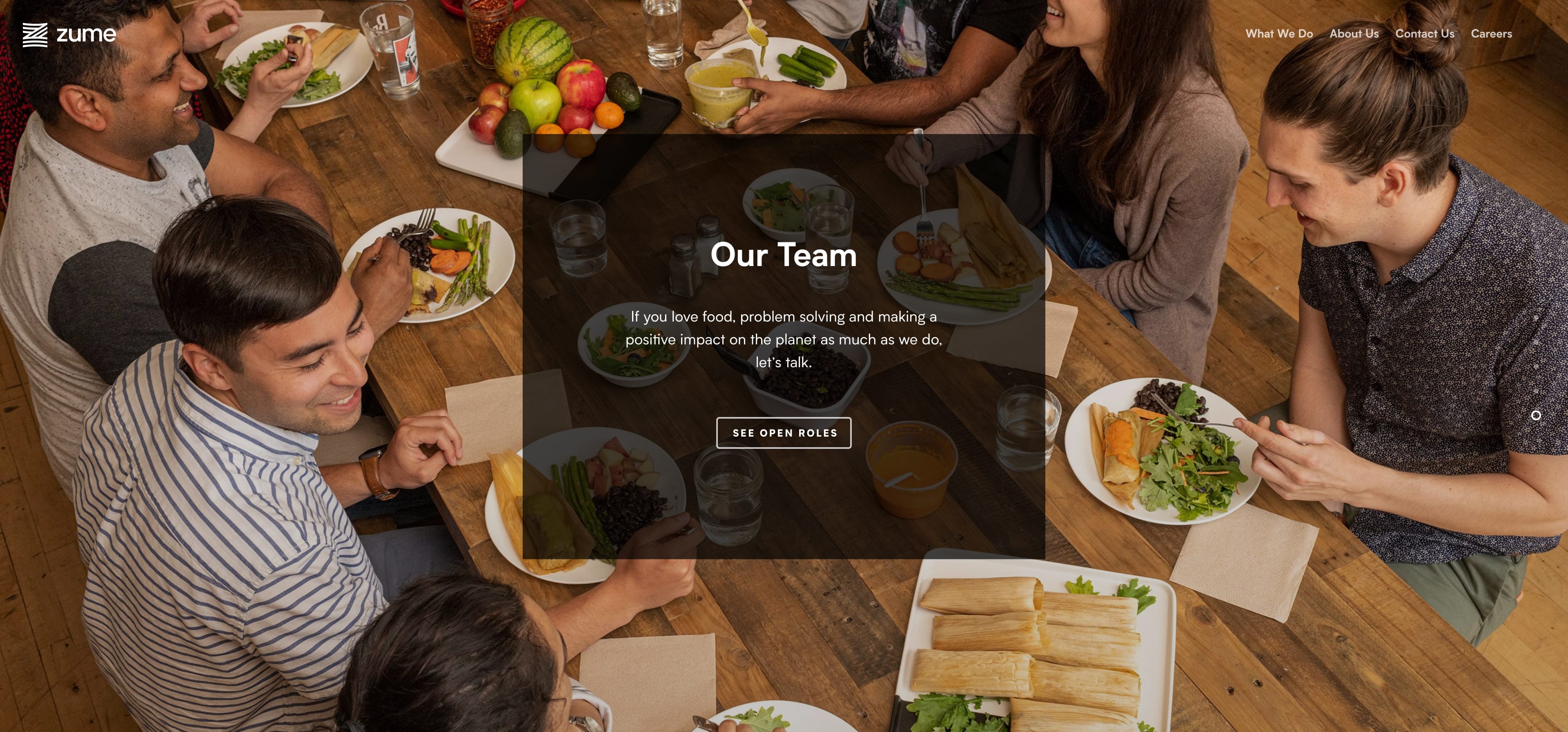
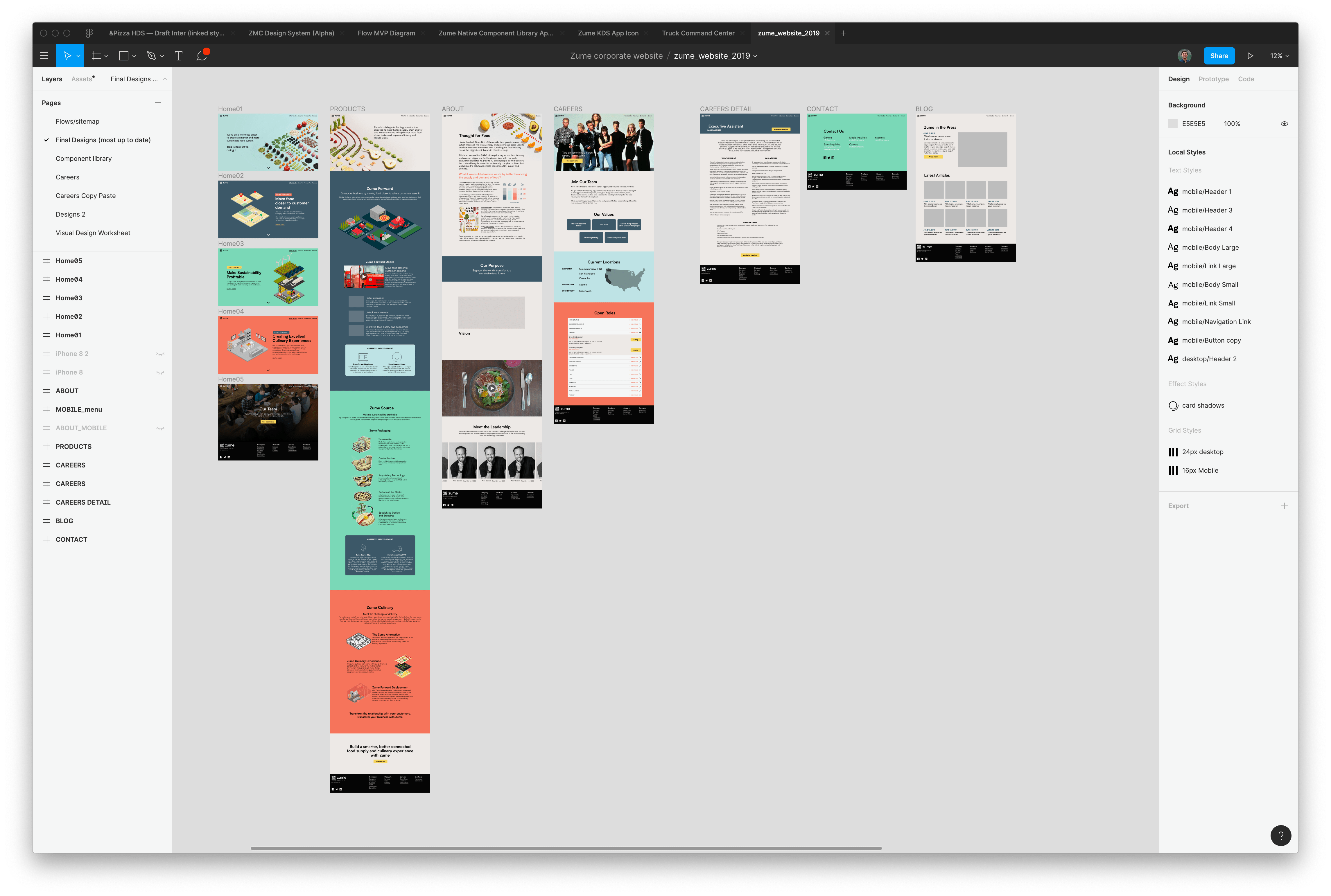
Worked with engineers to get setup on WP Engine, and then installed the WordPress Theme, plugins, and built the majority of the site with a coworker helping on minor details. I did as much troubleshooting as I could given the time, and I was then the main point of contact for any changes to the site.
Swag design + ordering
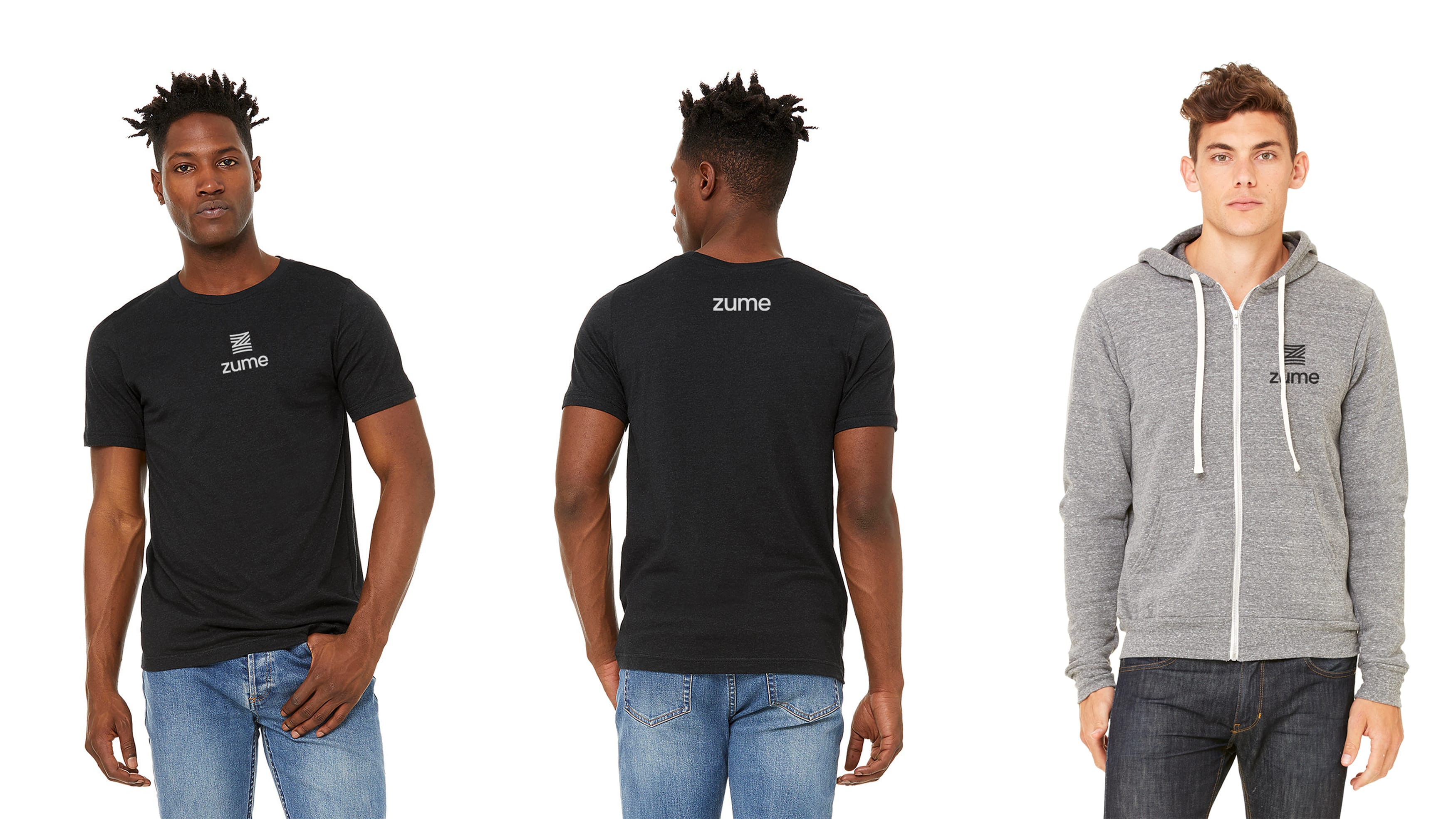
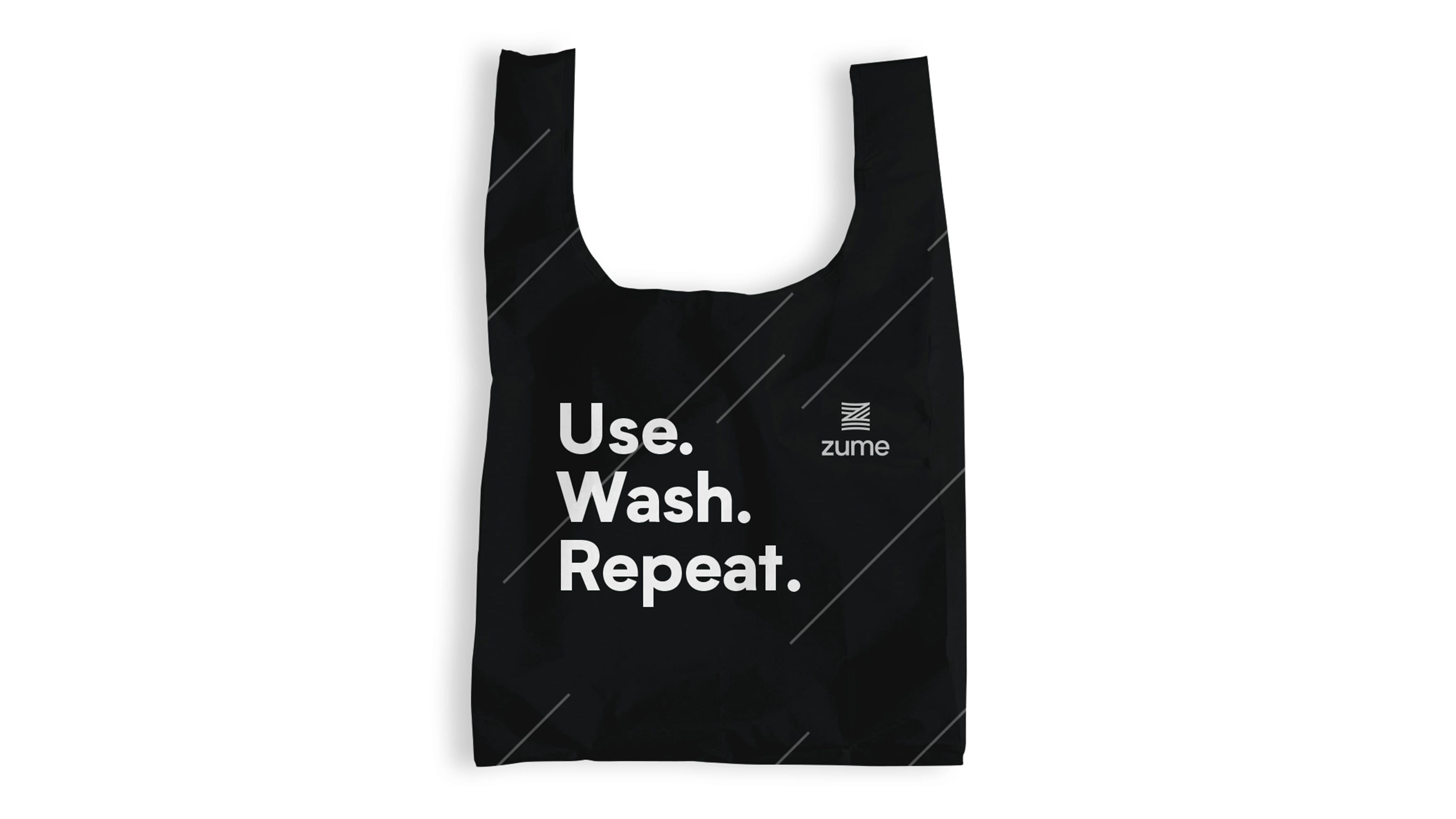
We needed swag for several hundred employees asap, and I had to design and order everything myself (no producers) with a given budget and coordinate with our people team for the final reveal. Most were simple "logo slaps" but I did have to design a reusable bag in a few hours to get it in production on time while parallel pathing the rest of the branding (colors weren't selected yet, so I chose black and white).
Coordinated web assets
Worked with the entire team to coordinate all asset delivery, which included pushing other designers to deliver illustrations that could work as .SVG properly, getting videos from our video editor and then editing and creating web-ready versions from said clips, and pushing writers to lock major content blocks as soon as possible (to then be able to finalize layouts quickly). We used Figma to have designers and writers working simultaneously as fast as possible on the wireframes/mockups.
A successful outcome
Although I stayed up working on the site until 4 a.m. the morning before the rebrand was announced, the new website launched without a hitch. Hundreds of employees all received their swag bags at the launch event, and it was really cool to see my work finally out in the open.

